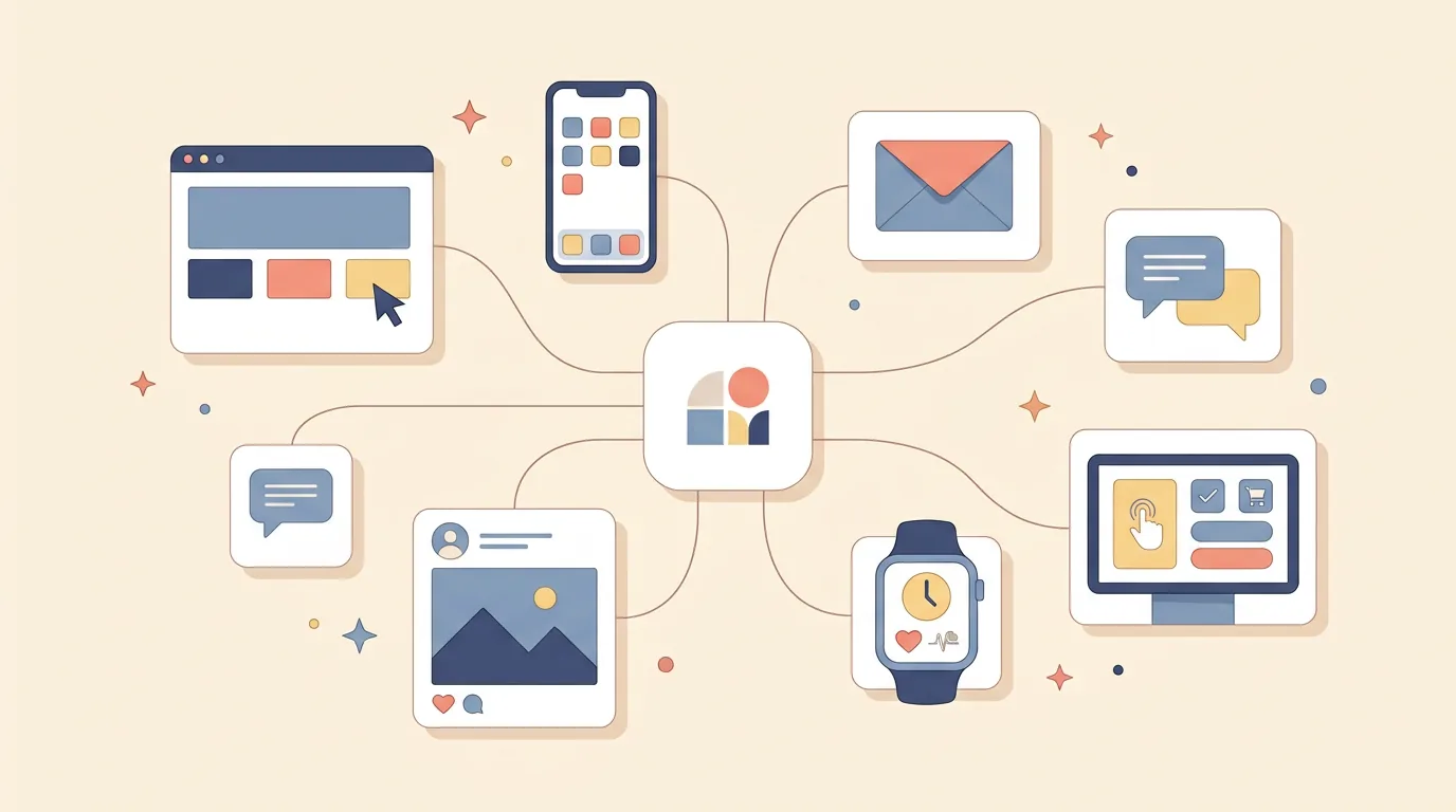
Digital experience design is the practice of designing every interaction a person has with a brand across all its digital touchpoints: website, app, email, chat, social, even the kiosk at the airport. Not one screen, not one product. The whole connected journey, designed so it feels like one thing instead of fifteen departments.
The term sounds like jargon for "web design," and it isn't. It's a wider lens than UI or UX alone, and understanding the difference explains why some brands feel effortless everywhere while others feel like a different company on every channel. This guide walks through the concept, where it sits among its neighboring disciplines, and what the work actually looks like.
What Is Digital Experience Design
Start from the observation that makes the discipline necessary: a customer doesn't experience your departments. They experience your brand, one interaction at a time, and in their mind all those interactions are the same thing. The ad they clicked, the site it opened, the checkout they abandoned, the email that brought them back, the chat agent who helped, the app where they tracked the order. Nobody at the company designed all of that together. That's the gap digital experience design exists to close.
So the practice is this: map every digital touchpoint a person has with a brand, design each one well, and, the part most organizations miss, design the seams between them. Where does the email land? Does the app know what the website knows? Does the tone on social match the tone in support? A digital experience designer treats those seams as design problems with the same seriousness as any screen.
The goal gets described with soft words, so let's use plainer ones. In practice it's measurable: journeys that don't dead-end, sessions that continue across devices, a brand that behaves like one personality everywhere it shows up.
The Zoom Levels: UI, UX, Digital Experience, CX
The clearest way to place this discipline is as a zoom level, because these terms describe the same world at different distances.
Zoom in all the way and there's UI: how one screen looks and responds. Pull back slightly and there's UX: how one product works as a whole, its flows and friction. Pull back further and you reach digital experience design: all of a brand's digital touchpoints, connected end to end. Pull back once more and there's CX, customer experience, which includes the offline world too: the store, the delivery, the phone support, the invoice. And service design zooms out to include everything behind the curtain that makes those experiences possible.
Each level has its own professionals, and the layers need each other. A brilliant app UX sitting inside a chaotic brand experience still loses customers, and the most beautiful cross-channel strategy can't survive a checkout that doesn't work. Digital experience design is the layer that asks, constantly, "but what does this feel like as one journey?"

What Digital Experience Design Actually Involves
The work starts with mapping. Journey maps trace the routes people actually take through a brand's digital presence, including the messy ones: the visitor who arrives from a social post deep into the site, the customer who starts on a laptop and finishes on a phone, the user who hits a dead-end email link. Every dead end and disconnected seam gets marked.
Then consistency work: making sure the visual language, tone, and behavior of every touchpoint belong to the same brand. Not identical, an email shouldn't look like an app, but recognizably related, like siblings rather than strangers.
Continuity is the technical heart of it. Cross-device journeys need shared state: the cart that follows you from desktop to phone, the support chat that knows what you just bought, the preferences set in the app that the website respects. This is where design and engineering have to hold hands, and where "flows without a bump" is actually earned.
Content and personalization sit inside the discipline too: the right message at the right stage, useful rather than creepy. And post-purchase moments, order tracking, support, renewal, loyalty, count exactly as much as the sale, because that's where most of the relationship happens.
Finally, measurement closes the loop: analytics and feedback watched across the whole journey, not per-channel vanity numbers, so the experience improves as one system.
A Worked Example: One Purchase, Six Touchpoints
Make it concrete with a purchase most people have lived.
A social ad catches someone's attention and leads to a product page that loads fast and explains itself: touchpoint one, doing its job. They add the item to the cart on a work laptop, then get pulled into a meeting: touchpoint two, interrupted by life. An hour later, a cart reminder arrives, short, polite, with a photo of the actual item: touchpoint three, and the first seam. They tap it from their phone, and the cart is right there, waiting: touchpoint four, and the seam that decides everything. Checkout takes two minutes. The next morning, a shipping confirmation with a live tracking link arrives: touchpoint five. A week later the package arrives early, and the app asks for a rating with one tap: touchpoint six.
Every one of those moments was designed, or wasn't. Change the details and feel the difference: the reminder email links to a generic homepage, the phone session doesn't remember the cart, the tracking page asks for an order number the email never provided. Same company, same budget, completely different brand.

What Ruins a Digital Experience
The failures have recognizable shapes.
Inconsistency: a brand that's playful on social, stiff in email, and hostile in its error messages. Users read that as three companies wearing one logo. Dead-end journeys: emails linking to homepages, confirmation pages with no next step, apps that abandon you right when a question appears. Siloed teams: web, app, marketing, and support each optimizing their own metrics, producing a journey that's six locally-perfect experiences stapled together. And broken continuity: the form that resets when you switch devices, the chat that starts from zero, the preferences that never sync.
All four failures share a root cause: nobody owned the journey. Which is also the job description, in one line.
Why It Matters for Your Business
Because your customers already experience your brand this way, whether you've designed it or not. They don't know which team owns the email versus the app. They experience one continuous thing, and their loyalty forms across the whole of it, not at your favorite touchpoint.
The economics follow. Retention, repeat purchase, and referrals all live downstream of the journey quality, and the journeys people actually take, across devices, across channels, across weeks, are precisely the ones no single screen design can save. Companies that invest at this layer tend to find that their individual touchpoints get better too, because the journey map exposes exactly which screens matter most.
That wide-angle work is part of how we think at Quadiz. We design individual products and websites, and we design them as touchpoints that have to live inside a larger experience: design with development under the same roof, so continuity is built rather than promised. Our case studies show products designed to hold up across whole journeys, not just in a portfolio crop. If your brand's digital experience has seams showing, book a free call and let's map them.
Tags:#Digital Experience#Experience Design#CX
Written byFounder & Lead Developer
Nayef
Visit Website ↗Tech enthusiast, lead developer, and founder of Quadiz.