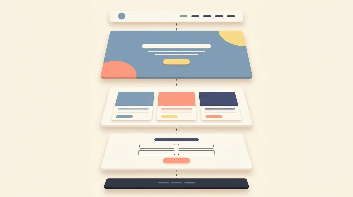
A website UI is everything on a website that you can see and interact with: the layout, navigation, buttons, forms, menus, links, and every visual element that responds when you touch it. If a visitor can look at it, click it, type into it, or scroll past it, it's part of the UI.
It's the term people reach for when a site feels effortless or infuriating, usually without knowing what sits inside it. This guide breaks the website UI into its actual parts: the anatomy every site shares, the states nobody notices until they're wrong, how it differs from app UI, and the signs that separate a well-made interface from a frustrating one.
What Is a Website UI
UI stands for user interface, and on a website it means the complete visible layer sitting between your content and your visitor. The words, the images, the buttons, the spacing between sections, the color of a link, the shape of a search box. Some of it moves, some of it responds, all of it was designed by someone, or worse, wasn't.
A useful way to see it: the UI is the car's dashboard and controls, while the engine runs underneath. On a website, the "engine" is code, content systems, and hosting; the UI is everything the visitor actually experiences. Both have to work, but visitors only judge the part they can see, which is why the interface carries so much of a site's credibility.
One distinction worth making early. The UI is not the design entirely, and it isn't the UX either. The structure of the site, what pages exist and how people flow through them, is UX territory. The UI is the layer built on top of that structure: what each page looks like and how each element behaves when touched.
The Anatomy of a Website UI
Nearly every website, from a portfolio to a massive store, is built from the same set of UI parts.
The header and navigation come first. Logo, menu, maybe a search bar and a call-to-action button. It's the part of the UI visitors consult most, which is why nav design gets argued about the most.
The hero sits below it: the big opening section with a headline, a supporting line, and usually one prominent button. Its whole job is answering "where am I and what do I do here" in about five seconds.
Content blocks follow: cards, image-and-text sections, feature grids, testimonials, pricing tables. These are the body of the site, and good UI keeps them rhythmically consistent so the page reads in a comfortable pattern.
Forms and inputs appear wherever the site wants something from the visitor: contact forms, newsletter boxes, checkout fields, logins. Text fields, dropdowns, checkboxes, and the labels and helper text around them are all UI, and all frequently under-designed.
The footer closes the page: secondary links, contact details, legal bits. Often treated as an afterthought, and regularly one of the most-visited areas of any site.
And then the interactive layer runs through everything: buttons and links, menus and mobile hamburger, accordions, carousels, tabs, search boxes, cookie banners, breadcrumbs, tooltips. Every element a visitor can poke.

The States Nobody Notices Until They're Wrong
Here's where website UI gets subtle. Every interactive element lives in multiple states, and each one needs a designed appearance.
The button is the classic example. Normal, hover, pressed, focused, loading, disabled: six appearances for one button, each with a job. Hover hints "you can click me." Pressed confirms "you did." Loading reassures "something is happening." Disabled explains "not yet, and ideally why."
Forms carry their own states: the field outline that turns red with a helpful message when an email is malformed, the green check when it isn't, the field that highlights when focused so you know where you're typing. Links change color once visited, menus slide open on phones, and cookie banners, well, those are part of the modern UI whether anyone likes it or not.
These states are invisible when designed well and unforgettable when designed badly. A form that fails silently, a button that gives no feedback, a menu that closes when you tap elsewhere without warning: each one is a small betrayal that adds up to a site that feels unfinished.

Website UI vs App UI
Websites and apps share UI fundamentals, but the website context changes several things.
Browsers bring their own furniture. The back button, tabs, refresh, and URL bar mean website UI never controls the whole experience, only the page inside it. Users navigate websites partially through browser habits, so the UI has to cooperate with those habits rather than fight them.
Screen sizes vary more. A website might be viewed at any width from a huge monitor to a small phone, so responsive design isn't a feature of good website UI, it's the baseline condition. Menus collapse, grids stack, and touch targets grow for fingers.
Visits are shorter and less committed. No install, no account, often no second chance. A website UI has to communicate and work immediately, and it gets judged alongside two open competitor tabs.
And scroll is the primary interaction. Apps are built from discrete screens; websites are built from pages that flow. Section rhythm, visual pacing down the page, and well-placed actions are website UI crafts that app UI rarely needs in the same way.
What Separates Good Website UI From Bad
You can audit any site in about two minutes with five checks.
Clarity of hierarchy: land on the page and notice where your eye goes first. If the answer is "nowhere in particular," the hierarchy failed. Obvious clickability: buttons look pressable, links look like links, and nothing important disguises itself as decoration. Consistency: the same element behaves the same way on every page, so learning happens once. Feedback: every click produces an immediate, visible response, even when the response is just "loading." And accessibility basics: text you can read against its background, focus states for keyboard users, targets sized for thumbs.
Bad UI announces itself in the opposites: menus you have to decode, buttons styled differently on every page, forms that fail without explanation, text you squint at, and interactions that leave you unsure whether anything happened.
Where does the good version come from? Almost never from one genius screen. Good website UI comes from decisions made before the screens: a defined visual language, a component set with its states, and rules for how new pages get assembled. Sites built that way stay consistent as they grow. Sites built page-by-page, by whoever touched them last, drift apart within months, and visitors feel the drift even when they can't name it. If you've ever scrolled a site and sensed it was "built by different people at different times," you were reading its production history through the UI.
None of this is mystery. It's discipline: decisions made once, applied everywhere, tested on real screens. That discipline is exactly what our design team brings to websites at Quadiz, and because our development sits under the same roof, the interface you approve is the interface that ships. Our case studies show full websites built this way, and if yours deserves the same treatment, book a free call and let's look at it together.
Tags:#Website UI#Web Design#Interface Design
Written byFounder & Lead Developer
Nayef
Visit Website ↗Tech enthusiast, lead developer, and founder of Quadiz.