A UI designer turns structure into a surface. Upstream of them, someone decides what a product does and how people move through it. The UI designer makes that journey visible and operable: every screen designed, every button drawn, every state accounted for, all of it consistent enough that users learn the product once and trust it forever.
That's the whole mandate in one sentence, and the craft behind it is deeper than most people assume. This guide gets specific: the visual language UI designers build, the components they design, the states nobody thinks about until they break, and the skills that separate professionals from people who own a design tool.
What Does a UI Designer Do
The cleanest definition: a UI designer designs the interface, the actual layer a human sees and touches. Not the research behind it, not the flows underneath it. The visible, clickable, tappable thing itself, and everything required to make it behave consistently at scale.
Two ideas carry the whole job. The first is translation: taking abstract decisions, "users need to see their recent activity," and turning them into a concrete screen where the eye lands in the right place and the next action is obvious. The second is consistency: making sure the product speaks one visual language everywhere, so a user who learned screen three can operate screen thirty without relearning anything.
That second idea is quietly the harder one. Anyone can design one beautiful screen. Designing four hundred screens that feel like one product, under deadlines, across platforms, is the actual profession.
The Visual Language They Build
Before any single screen, a UI designer builds the language every screen will speak.
Color comes first, and it's a system, not a preference. A working palette defines brand colors, functional colors that mean success, warning, and error, neutral grays in a dozen deliberate steps, and the rules for when each appears. Change one badly and users stop trusting what red means.
Typography is a scale, not a font pick. Designers define a small ladder of text sizes and weights: what a heading looks like, what body text looks like, what a caption is allowed to be, and the rule that anything outside the ladder doesn't ship. The result reads as order instead of noise.
Spacing and grid are the invisible half of the craft. Consistent margins, padding, and alignment are why some products feel calm and others feel like a garage sale, and most users could never name the difference. Elevation and shadow communicate what's interactive and what's background. Iconography, one drawing style for every icon in the product, finishes the language.
Together these become the product's face, documented so that every future screen inherits it rather than reinventing it.

Components and Their Many States
Screens are assembled from components, and components are where UI designers live most of their working hours.
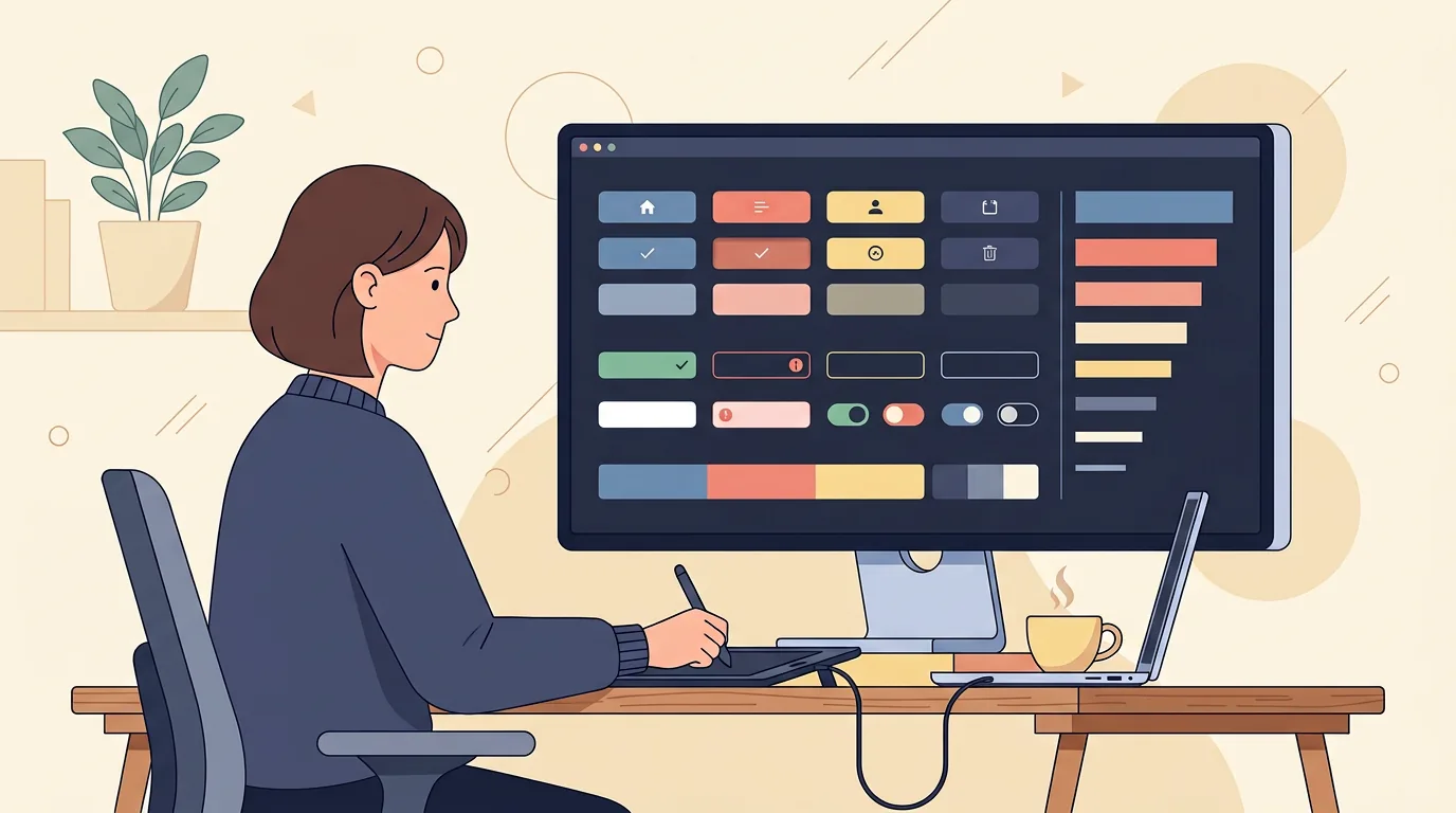
A single button looks trivial until you count its states: normal, hover, pressed, focused, loading, disabled, and sometimes success. Each one needs a designed appearance and a rule for when it appears. Now multiply by every component in the product: inputs with their error and helper text, dropdowns with their open and selected states, toggles, tabs, modals, tooltips, navigation, tables, cards, toasts. A mature product has dozens of component families, all documented.
Then come the states nobody puts in mockups until a UI designer insists: the empty state a user sees before any data exists, the error state when the network fails, the loading state that makes a wait feel intentional instead of broken. These aren't decoration. They're the moments where products feel either finished or abandoned, and designing them is pure professional habit.
The output of all this is the component library: every element, in every state, built once and reused everywhere. It's also what makes large products financially sane, because the hundredth screen costs a fraction of the first.
Screens, Layouts, and Responsiveness
With language and components in place, the designer composes actual screens, and composition is a skill of its own.
Hierarchy decides what a screen is for: one primary action, a few secondary ones, everything else supporting. The designer choreographs attention with size, weight, color, and space, because on any given screen, a user should never have to ask what they're supposed to do.
Responsive work adapts each screen to reality. A layout that shines on a wide monitor has to survive a tablet and a mid-range phone with its logic intact: what collapses, what hides, what moves, what gets a bottom sheet instead. Designing this once, thoughtfully, saves engineers from improvising it later, badly.
Micro-interactions round out the layer: the hover that hints clickability, the toggle that answers with a satisfying state change, the transition that shows where a panel came from. Small, purposeful, and specified, because animation decided casually looks different in every developer's hands.

Accessibility and Handoff
Two responsibilities sit at the end of the UI craft, and both separate professionals from hobbyists.
Accessibility is design work, not an audit afterthought. Contrast ratios checked, not eyeballed. Focus states designed for people who don't use a mouse. Touch targets sized for real fingers. Motion that respects system settings for reduced animation. A beautiful interface that excludes people isn't finished, and the UI designer is the last person who can fix it cheaply.
Handoff is the other one, and it's where great UI designers quietly earn their rate. Screens get annotated: exact spacing, behavior rules, every state named. Assets get exported in the formats developers need. The file gets organized so an engineer can find things without a tour guide. Then, after the build, the designer runs design QA, comparing shipped code against approved designs and catching every drift. Products look like their mockups for exactly one reason: someone checked.
The payoff for all this rigor compounds over time. A product with a real component library ships new features faster, onboards new designers faster, and stays visually coherent no matter how many hands touch it. A product without one pays a redesign tax on every screen. Same pixels up front, wildly different invoices later.
The Skills and Tools Behind the Craft
The skill list is longer than the job title suggests. Visual hierarchy and layout systems. Typography and color theory as working knowledge, not taste. Obsessive attention to detail, because a two-pixel inconsistency is the difference between polish and sloppiness. Empathy for edge cases: the long German word that breaks the button, the low-vision user, the panicked error moment. And communication, because UI designers defend decisions to stakeholders daily and translate constantly for developers.
Tools are the smaller half: one design tool learned deeply, with its component and variable systems mastered, does more than a resume full of software names. For positioning against neighbors: UX designers own the research and flows upstream; graphic designers own brand and communication in flat media; UI designers own the interactive surface itself. Three crafts, one product, different layers.
If there's a single tell of a strong UI designer, it's what they ask before designing anything. Amateurs ask for the brand colors and start arranging screens. Professionals ask what states this component needs, what happens when the text is twice as long, what the user sees while this loads, where the error appears, and who maintains the file after handoff. The questions are the craft; the screens are just the answers made visible.
That last layer is our home ground at Quadiz. Our design team builds visual languages and component systems for products, then carries them into development so what ships matches what was approved, and our case studies show exactly that consistency at scale. If your product's interface needs a professional's hand rather than a patchwork, book a free call and let's look at it together.
Tags:#UI Designer#Interface Design#Design Systems
Written byFounder & Lead Developer
Nayef
Visit Website ↗Tech enthusiast, lead developer, and founder of Quadiz.